Wednesday, August 29, 2012

TORN!

RIO
This week I am taking a workshop from the fabulous Derek Gores.  His collaged images made from magazines are spectacular and I was excited that the Santa Clara Watercolor Society was bringing him to San Jose.  My goal is to learn his process and then, somehow, incorporate it into what I do.  This process is amazingly difficult.  Just tearing paper is maddening.  It will tear fairly straight in one direction, but is almost impossible to control the tear in the other direction.  I desperately wanted to cheat and use a scissors!  I started carefully watching exactly how Derek was tearing the papers and got a little better at it.  Using text as form and value is an exciting element in this kind of work.  Derek's transitions are amazing and everyone in the workshop will never be able to look at a magazine in the same way again. 

 This was a large canvas and I am pleased that I was able to finish it in three days.  Tomorrow I will do a smaller square.  He suggests doing a simple single object like his demo of a shoe which I have posted below.  It is tempting, but this is a signature object for him and I don't want to do something so associated with him.  I decided to do a head (surprise!) with the idea in mind that I will then combine it in some way with other things to create my own look.  I don't know exactly what that might be, but I have a few ideas rattling around in my head.  I will probably do a number of different combinations just to see how it might work.  This has been a very enjoyable workshop and Derek is a very knowledgable artists and excellent instructor.  Everyone is producing amazing work.
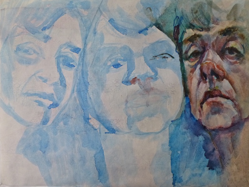
RIO (STEP 1)
Here is how this piece looked after a few hours of work.  You can see part of the drawing that hasn't been covered yet.

This is Derek's demo of his iconic fashion shoe which was our demo for today.  If you click on the image it will come up in a new screen and you can see all the fun details.  

DEREK GORE DEMO: RED SHOE


Sunday, August 26, 2012

RELATIONS!

SISTERS
I have been working on this painting the last few days.  I have 3 photos of myself with my two sisters taken over the last 20 years which I love.  I keep them together on my desk.  This is based on the earliest photo because of the composition, but I am adding a few years just because I want it to reflect us more as we are today.  In the photo we have big smiles on faces but I don't like to paint happy smiley faces, so it is a little tricky adjusting the facial muscles.  I also changed the lighting and moved the faces closer together.  While I am working on the painting I am thinking about titles.  So far, I have "The 3 Graces" and "Mom Always Liked You Best".  

I am particularly enjoying painting on the surface I created.  I took a failed Tyvek painting and covered it with gesso, then using a sponge roller, smoothed out the streaks and then stamped into the wet gesso and let it dry.  It took a long time because the paper is not absorbent.   I am using watercolor sticks (not crayons) for the color.  I love being able to draw and scribble, then work it with a wet brush.  The blue drawing was done with a diluted mixture of Dr. Martin's Hydrus liquid watercolor in Cobalt Blue.

Here is a close up of the surface and paint.  If you want to experiment with Tyvek, the post office has envelopes you can practice with.  Here is a company where you can order small quantities if you decide you like this interesting paper.  http://www.allweatherblueprints.com/tyvek-sheets-printing.html

detail SISTERS

Saturday, August 25, 2012

50/50 SHOW RECEPTION!

50/50 DISPLAY


I thought I would start with my display!  It was an exciting night with so much to see....70 artists times 50 images!  After quickly making the rounds to see everything,  I was feeling dizzy but then realized it was probably the wine!   I sold seven of these images and was surprised at people's favorites.  Mine are still on the wall.  A good lesson not to influence others with your opinion.  The show is up for awhile so if you are in the area, be sure and stop by.  The Sanchez Art Center is open only Friday, Saturday and Sunday.   I photographed some of my favorites before the sold ones were removed.  I didn't get a chance to photograph all of my favorites, but here are a few so you can get some idea of the scope of the show.  It was a wonderful crowd and I want to thank those who were able to come.  I hope you loved the show.
50/50 LESLIE LAMBERT
This work is by my good friend Leslie Lambert.  I love her ink drawings which are all done from live model sessions.  They looked fabulous as a grouping.  The addition of areas of color adds to the appeal.

50/50 CUPS
This next series had to do with a single cup.  Each piece individually was okay but I think the aggregate was much more compelling.  This was a real favorite of mine but I would like to see it sold as one.  This is an excellent example of the power of a series.  Often we are looking for something unique or exciting to paint when a simple everyday object is really all we need!


50/50 GLOWING ABSTRACTS
This next series was all about color.  I don't know if you can really appreciate it in this small photo but each panel had a wonderful glow. Again, a very simple construct using color imaginatively.


50/50 QUEEN FOR A DAY 
I totally loved this series.  This was another that I would love to keep as a complete set.  It combined collage and some pencil work with a wonderful whimsical appeal.

50/50 SUN PRINTS
This set of panels was beautiful.  Each image was interesting in it's own right, but wonderful together.  I always thought sun prints were blue, so I loved seeing the variety of color.

50/50 LAYERED CUT WORK
This work was most intriguing.  Each layer looked like it had been laser cut and collaged over the previous layer.  There were 3 or 4 layers to each piece.  Gorgeous!

Saturday, August 18, 2012

I'M READY FOR MY CLOSE UP!

50/50 INSTALLATION

50/50 CARTOON FOR NAIL PLACEMENT

50/50 INSTALLATION WITH MY ASSISTANT AND ME!
It was a gorgeous day, so Jerry and I decided to drive west over the mountain to Half Moon Bay and have lunch before we headed up the coast to Pacifica to the Sanchez Art Center.  When we arrived, I drew a number out of a basket to determine where I would be in the art center.  It turned out to be in the central hall of the main building.  I was happy with that space.  They handed you a cup with nails in it and some wall putty to secure the bottom of each panel to the wall.  We brought the hammer and a level.  There were several people walking around giving guidance, suggestions and help where needed.  I really appreciated my husband helping me with this, especially the top row which would have required a step stool for me.  I was a little unhappy with the lighting but was told they don't set the lighting until after the entire show is up.  There are two more days available for artists to bring their work.  I was going to use the first photo in my blurb book but I realize there is a piece of blue tape that has to be removed.  I think I will reprint my bio with a bigger font size because it is up high and it is too difficult to read the way it is.  I can switch it out right before the show.  I am happy with the final effect and can't wait for opening night.   It should be fabulous with everyone's work up.  I hope some of you can make it to the show.

Friday, August 17, 2012

SOMEONE'S MISSING!

50/50 #50 
50/50 (50)
Math was never my thing but I used to be able to count to 50 without any trouble.  Not anymore!  I am missing an image and I can't figure out which one I left out.  Maybe tomorrow when I post the installation, one of you will find the culprit and point it out to me.  

I thought I was going to have trouble with this background but I think it worked quite well.  The red spots add an interesting dimension to the face and by glazing the green with sepia, it quieted the bright green down.  I thought about glazing the white highlights with a neutral or warm color but decided to just leave it the way it is.  A good piece to finish the series with.  

Thursday, August 16, 2012

SIGNED AND DATED!

50/50 #48

The background on today's tile was created by placing a lace patterned washi paper over the watercolor paper and scraping heavy gloss gel through the openings with an old credit card.  The washi paper was then lifted off of the watercolor paper  and I glued it down on another board using more gloss gel.  This second image has the glued washi lace paper on it.  Side by side you can see the different effect with the same paper. The pattern seems to dominate much more with the first process.  There are a number of different patterns available and I love to add to my collection!

Today, I signed my name to the back of each panel and dated it.  I am ready and anxious to get the installation up.  


DRAWING NEAR!

50/50 #47

50/50 (47)
This background was created by using gesso on a commercial stamp.  White gesso on white paper can create a subtle effect if glazed like this one with a light wash.  If I used a much darker color, the texture would stand out much more.  The part of the paper without the gesso absorbs the paint much more, creating the contrast.  It's good to learn which techniques don't create so much contrast with the final image but do create some additional interest to the piece.

Tuesday, August 14, 2012

GETTING CLOSE!

50/50 #46

50/50 (46)
This background is a variety of Asian papers collaged down then glazed with a few colors.  This was one of my most favorite backgrounds.  I am definitely going to do this idea in a larger format sometime soon.  The drawing works very well on this surface.  It just needed a little white accents.

Monday, August 13, 2012

COMING DOWN TO THE FINISH LINE!

50/50 #45
At the very beginning of this project, I decided to paint the sides of the panels as they would be showing and I thought it might look good if it had various colors.  I divided the panels equally among the major hues and then did variations on each hue so that each panel had a distinctly different edge color.  When I went to add collage material and glazing colors, the edge of the panel determined color family I worked with.  This piece was from the purple palette and I had added black to the original color so it needed something in the maroon family for the collage material.  This made for a fairly dark background.  I used a fair amount of white acrylic to add definition to the black drawn lines.  Overall, I think it suits the emotion very well.

You know that you can click on the image and bring it up larger in a separate screen.  The texture shows up quite well that way.

Sunday, August 12, 2012

GOING, GOING, GONE!

50/50 #44

50/50 (44)
This background was made with crackle paste over the watercolor paper and when dry, glazed with cerulean blue and neutral tint with some Kosher salt thrown in for good measure.  I am always disappointed that I don't seem to get really exciting cracks developing but the pigment helps to bring what is there, out.  The salt acts a little visually like ages spots!  This particular tile has already been purchased!  I will hang it in the show with a red dot and the owner will probably take it home opening night.
\

Saturday, August 11, 2012

GETTING CLOSE TO THE FINISH LINE!

50/50 #43
This background has a number of layers of tissue as I worked to tone down the brightness of the color.  The last layer is a bronze acrylic glaze.  It leaves a slight sparkle to the surface which is an interesting contrast to this bushman image.   I loved the strong features and great hair of this gentleman.  A fairly simple drawing with such a busy surface.

Friday, August 10, 2012

MY BLUE PHASE!

50/50 #42
50/50 (42)
This was another subtle background with a simple drawing.  This is a technique that I have used many times.  I stamp into wet gesso.  This was a commercial stamp giving a nice rough texture to the surface.  I glazed it with a soft cerulean blue.  A very sketchy looking drawing with a little tonal value added for interest.

Thursday, August 9, 2012

TOO SUBTLE?

50/50 #41
This started as a gesso stamped tissue onto white paper then several light glazes were applied.  The pattern barely showed up.  I think if the watercolor paper had been painted with a darker color first, then the paper collaged over, the pattern would show up much more.  So these are the things you learn by making just one change in the procedure.  Each decision makes a difference in the result.  If you want a subtle effect, this is an interesting way to go.

Wednesday, August 8, 2012

AM I BLUE?

50/50 #40

The simplicity of this background doesn't compete with the drawing.  I like how this one came out.  The background papers on this piece comes from a very simple technique that produces great results.  I got the idea from Edward Betts bookMaster Class in Watermedia.  (around the top of my list of great books) where he paints brushstrokes through tissue onto watercolor paper.  The tissue blocks some of the paint giving an uneven stroke on the watercolor paper in a way that is impossible to get with a straight forward approach.  I save the tissue! (of course) and then I decided to drop some tissue onto the butcher's tray I was using as a palette  and lifted off the residue that was there.  You have to carefully lift it up and drape it over a chair back or something until it dries as wet tissue is very fragile.  Anyway, that's how you can get that blotchy look.  So many times our palette looks so much  more beautiful than the painting!  Now you can capture that beauty.  It also appeals to the frugal nature in some of use.  Nothing wasted!

Tuesday, August 7, 2012

HIDE AND SEEK!

50/50 #39
This was one of the most unusual backgrounds.  I wasn't sure if I wanted to put a drawing on top but it wasn't of any use to me without the drawing, so I took a chance.  I think it turned out alright.

There is a technique in Mary Todd Beam's second book where you take a piece of foil, paint it with black gesso, turn it over onto a piece of watercolor paper and draw on the back of the foil with a dull pencil, transferring black gesso lines onto the paper.  This background started with a saved piece of foil that had been used for that technique.  It has interesting silver lines where the gesso had been transferred.  Next I collaged some of my tissue paper that had been stenciled with white gesso hearts.  I decided to put a bronze metallic acrylic glaze over the piece to make it look antiqued.  Lastly I put the ink drawing on top.  I lucked out and the image worked okay with the background.  If it didn't, I would have ruined a special start.  Sometimes you just have to take a risk.  Ultimately, it's just a piece of paper.

Monday, August 6, 2012

GOING STARK RAVING MAD!

50/50 #38
I didn't post last night because I thought the battery had died in my computer.  Turns out I had a bad connection and everything is fine!  

Back to business....the title of this post refers to this poor soul who I photographed in Bordeaux.  The background is all Tyvek.  I tore up an unsuccessful painting and collaged it down with the painted sides up. The trick to tearing Tyvek is to make a small cut with a scissors, then pull it apart.    It needed some light areas so I turned some of the pieces of torn Tyvek over and added them to the mix.  The background was so "busy" that I kept the drawing simple.  

Saturday, August 4, 2012

2 FOR THE PRICE OF 1

50/50 #36
I was caught up in the Olympics and forgot to post last night, so here are two more instead of one.
#36 is another aluminum foil painting.  There is a technique in the last book by Mary Todd Beam where you coat the dull side of aluminum foil with black gesso, turn it over onto a piece of watercolor paper and draw on the back, transferring the gesso lines.   It looks something like a woodcut.  My friend, Kathy Mitchell, has worked with this technique to great effect and does some stunning work.  I have tried it maybe 5 times with mixed results.  This piece of foil had gold gesso on it instead of black and I had saved it from the original project.  Never throw anything away!  After glueing it down, gesso side up, with gel medium, I collaged some tissue which had been stamped with archival brown ink.  It altered the surface is a very subtle way because the brown ink almost disappears into the gold background.   The ink drawing was applied in my usual manner.

50/50 #37
This background  uses a lace patterned washi paper.  On another panel, I scraped white gesso through the paper.  I then stuck this same lace paper down on this panel and covered it with heavy gloss gel.  The same washi paper created two very different surfaces.  After the gel medium was dry I glazed the surface with  wash of Cerulean Blue Acrylic.  It has a fairly slick surface which is reflected in the way the black line drawing is so fluid.  I used diluted black gesso for the drawing as I didn't think the ink would be permanent on such a plastic surface.


Thursday, August 2, 2012

GOING FOR A METAL!

50/50 #35
This background has aluminum foil crushed and a brayer run over to flatten.  Glued down with heavy gloss gel.  The rest of the paper is covered with the same heavy gloss gel and then stamped .  Great surface to draw a wrinkled face.


Wednesday, August 1, 2012

NEWLY PUBLISHED!

50/50 #34

This is one of my favorite backgrounds.  I will be sure and use it again in a larger piece.  Naturally, I forgot to photograph it before I drew on top.  I am finding more and more that I have to take action immediately or the thought is gone and may never return.  It is a help with my procrastination tendencies but not always convenient.  

This background is various washi papers glued down with some torn Tyvek thrown in for good measure.  I painted the papers after they dried  then did the ink drawing on top with my Lizard's Lick #4 from Cheap Joe.  

I sent the book off into cyber space to be printed.  I hope the images bleed out to the edge as that is how I wanted it.  I am not sure that is how it will turn out.  There is a feature while you are creating the book that shows you what will get cut off so I sized each image to allow for that.  The preview of the book shows a white border around each image, which is not what I wanted.  I'll have to wait and see if I need to make any adjustments for future copies.  I plan to add some photos of the event in future copies but I couldn't wait to see a finished copy of the book.  Impatient as always!

Related Posts with Thumbnails