 |
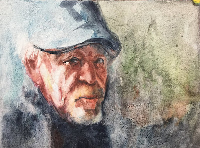
| SONOMA WATERCOLOR SOCIETY DEMO 1/2019 |
The Sonoma Watercolor Society kindly asked me to do a demo for them for their January Meeting. It was a very stormy day when we drove the 2 hours to Santa Rosa but it was a wonderful turnout and I enjoyed sharing my new set of Primatek Daniel Smith paints I had received as an award from the California Watercolor Society annual national competition. I was anxious to try them out. The surface I prepared was gesso that had been texturized which made it extremely liftable. That turned out to be the good news/bad news. At the end of the two-hour demo, this was how far the painting was resolved. At this point, my biggest dissatisfaction was the dark blue area under the beard.
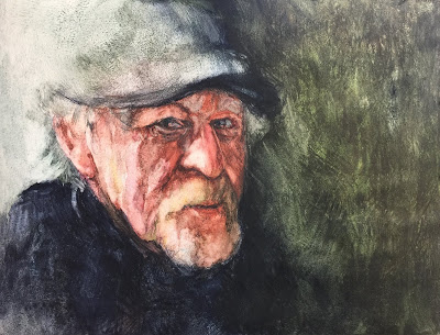 |
| DEMO SONOMA WATERCOLOR SOCIETY #2 |
After working on the painting back in my studio, I had resolved the background and garment to my satisfaction. I liked the character of the pigment in those areas as well as the hat but I did not like the skin tone or look of the pigment buildup in the dark areas of the face. Soooo........
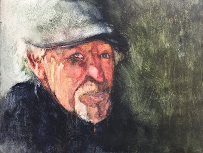 |
| DEMO SONOMA WATERCOLOR SOCIETY #3 |
I decided I wanted to use more transparent and more vibrant colors for the skin and wiped out some of the Primatek pigment and liked the new color better but was not happy with the overall appearance of the facial features. Soooo.....
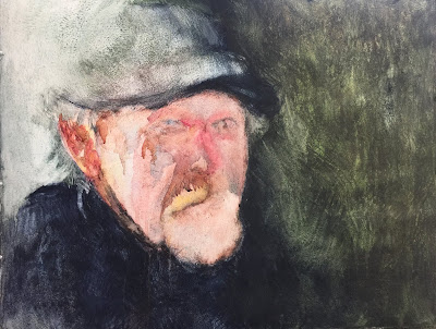 |
| DEMO SONOMA WATERCOLOR SOCIETY #4 |
I totally removed the color from the face and started over. As you can see, there was enough of the eye placement and nose to not have to start from a blank slate. My husband (the subject) was not happy that I had erased the original face as he liked it and told me not to "mess it up!" but one has to be willing to take a risk in order to create the best version possible within one's abilities at the time. If it resulted in losing a so-so painting, I was okay with that. Basically, it is only a piece of paper. The only thing lost is a few hours and a little paint.
For the next week, I worked on the painting and struggled mostly with getting the nose painted in a way that I could accept. I must have wiped out and repainted that area 25 times! I wish I had actually tallied the attempts. The liftability of the of the surface made it difficult to get the depth of color and edges just right. I was determined to master this exasperating challenge so I soldiered on and FINALLY was satisfied with the last version.
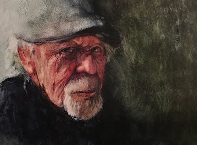 |
| DEMO SONOMA WATERCOLOR SOCIETY #5 FINISHED PORTRAIT JERRY |
Here is the first and final painting side by side.


