Monday, December 30, 2013

DELIVERED AS PROMISED!


Here is the final painting on a half sheet 15 x 21.  Below is how it started out with the collage before I added the faces.  Starting in the upper left hand corner the subjects are: Fellow artist and friend Ted Nuttall, the "stranger", Nephew Scott Zavalo.  Row 2: Nephew Donald Zavalo, Me, Brother in Law David Wacknov.  Bottom row:  Fellow artist and friend Mark Mehaffey, fellow artist and friend Ken Goldman and husband, Jerry Wacknov.  Why the stranger?  Cause I didn't have this totally thought out and I started with that interesting face.  In retrospect, I would have preferred using a another friend in this spot.  It does create an interesting title, however.  If I didn't tell you who everybody was, you might think everyone is trying to figure out who the stranger is.  Kind of a visual "CLUE" game.


Sunday, December 29, 2013

SURROUNDED BY FABULOUS MEN!

This is the last segment of the painting.  I placed myself in the center because we are all self centric and our world revolves around ourselves.  I am surrounded by very special friends and family with one stranger.  Perhaps a friend I have yet to meet.

Saturday, December 28, 2013

I AM ALL THAT IS LEFT!

Here is the next to the last image.  My self portrait will be revealed tomorrow and the total painting will finish up the year.  Any guesses as to the identity of this great painter?  

I just finished watching a video by Mark Mehaffey painting on YUPO.  I started mine today.  So fun and it looks absolutely nothing like the video.  Funny how that works.

I hope everyone is planning their art strategies for the coming year so you can be energized on Jan. 1.

Tuesday, December 24, 2013

HAPPY HOLIDAY


I am having trouble posting from my computer, is I will try from my iPad. The painting is completed but I am going to show each panel in a separate post, then the finished work. A big HAPPY BIRTHDAY to today's subject. This one is painted in a more traditional skin tone than a few of the others. I had to go back into four other panels and adjust them so the whole painting was consistent in presentation.

Thursday, December 19, 2013

CLOSING IN ON FINISHING THIS PAINTING!

Jerry

I am pleased with the interaction of the background with the foreground in this one.  Two and one half faces to go.  One half?  Yes, I am partially finished with the center panel.

I went to see a fabulous exhibit yesterday at the DeYoung Museum in Golden Gate Park, San Francisco.  David Hockney has produced an amazing series of works, both landscape and portraiture, in a wide variety of mediums….watercolor, oil, acrylic, charcoal, video and digital drawing and painting.  Most of these works have been presented by combining multiple pieces, framed as one.  The digital prints have very subtle seaming but most of the canvases are not in total alignment of the imagery and some are actually framed in thin wood and then put together like looking through a window that had multiple panes.  The seams became part of the image.  I don't remember seeing art presented this way before.   The enlarged digital prints were very exciting.  Much of what is being passed around on the internet regarding digital imagery is very photo realistic.  These pieces look like paintings with Hockney trademark strokes and stylization.  If you can't get to the exhibit, there is a video available as well as a book.  I have mine reserved at my local library, on a waiting list.  In the meantime, ideas generated by this wonderful exhibit are swimming around in my head!

Tuesday, December 17, 2013

ADDING ONE MORE


Another family member to add to the mix.  I started sketching the images onto the collage with a white charcoal pencil/pastel pencil for the lightest values and a charcoal pencil for the darkest values.  I don't know why I didn't think of this idea sooner.  Because the collage paper is coated with acrylic medium, I can easily "erase" the pencil with a damp paper towel  or wet it with a brush and wipe it away.  When I am satisfied, I wet the pastel/charcoal to lift off the excess powder and paint right over it.  I must remember to add these two pencils to my supply list for my students.

Friday, December 6, 2013

ANOTHER FAMILIAR FACE

Upper left hand corner


Not a lot of the original background collage is showing up but it does make for an interesting hint here and there.  I have been preparing my resource material the past few days, deciding which face will go where.  Only one face of the nine is a stranger.  That gave me an idea for a title.  "A Stranger among Us".  Thinking up titles is very entertaining.  

Monday, December 2, 2013

THIRD OF NINE!


Here is the next 5" x 7 " segment of the painting.  Interesting challenge to use just white, burnt sienna and ultramarine.  I am trying to preserve as much of the collaged papers as I can.  This is one of my husband's brothers.

Friday, November 29, 2013

HAPPY THANKSGIVING, NOW BACK TO WORK!


I am happily back in the studio.  I managed to get 3 more bozzettos painted today.  I am going to present them one at a time!  Not much of the painted collage papers are winding up visible, but I think they still have an impact on the total piece.   This is Scott, our nephew.  He was just learning to read when we got married 50 years ago and now he has more grey hair than I do.  Ah, what a miracle hair dye is! 
A wonderful family celebration a few weeks ago netted some great photos for my files.  I do get tired of  painting my own face.

Thursday, November 14, 2013

WHAT LIES BENEATH!


I had only enough time today to paint this one 5 x 7 rectangle.  Right now I am only using 3 colors: white, ultramarine and burnt sienna.  The white and sienna are heavy open acrylics but the blue is an acrylic ink.  I am trying to leave the tone of the under layer showing through but I am having to make corrections along the way which results in covering up.  I am not drawing the image before painting but just massing in the shapes with light value and dark value while leaving the paper as the mid value.  I am going to leave the white alone for now.  When all nine sections are complete, I will evaluate the overall effect and possibly glaze much of the white.   So far I am pleased with the effect.

Traveling again over the weekend but then back at work on Tuesday.  

Wednesday, November 13, 2013

PREPPING!


I can't believe I have not posted in so long!  I have been doing a lot of traveling and a little art.  We are traveling again over the weekend but then I will be home for quite a while and I look forward to making progress on designing my new workshop.  I am very excited about the idea of incorporating a digital app program for the iPad or iPhone in the workshop.  I am using PS Touch which is an inexpensive version of Photoshop Elements for digital media.  I have been using my iPad mini to take photos more and more because the image is instantly available for playing.  I also use my regular digital camera because does a better job or photography, but for my purposes, the iPad mini is pretty good.   I am particularly fond of the "Charcoal" setting because it breaks down the image into 3 values in an artful way.  I like working from a black, white and gray image because it gives me free reign on color choice.  I decided to create a painting where the medium value would be represented by collage papers and then I would pop in the darks and hit it with the highlights.  I spent part of today creating the collage mid values on a false start painting that had been divided into nine  5 x 7 segments.  Depending on how these go, I will create a large single image painting with this idea. 

I have a lot of fun making these little abstract backgrounds.  Here is a closeup of one of them.  Somehow, It is a lot easier for me to work this scale than really big when it comes to collage.


Sunday, October 6, 2013

THE AMAZINGLY VERSATILE TYVEK!

TYVEK STENCIL
I discovered through some meanderings on the web, that TYVEK is a good stencil material.  The timing was perfect for my next painting.  I have been struggling with creating a portrait with just a few simple shapes, so I created a NOTAN (black/white) image from a photograph I took with my iPad by running it through a filter in Photoshop Elements.  It is important that the shapes be interesting.  Since I was going to create a stencil, either the positive or the negative needed to be linked so the piece would hold together.  Most stencil material is not very large, so this was an exciting discovery.  I created a simple grid so I could enlarge the image and drew it with a watercolor crayon.  I could easily make changes and corrections by wetting and rubbing out the mistake.  I used a Darice Ultimate Crafting Tool that has 8 metal tips, one of which is for stencil cutting and has a very fine point with a bent tip making it very easy to see what you are doing.  I had a heat proof sheet underneath the TYVEK to protect the support surface.  It was like cutting butter with a hot knife!  If you want to make smaller stencils, you can get free TYVEK envelopes at the Post Office.
GESSO SCRAPED THROUGH THE TYVEK STENCIL
The next step was to scrape gesso through the stencil which had been placed over a failed painting I had worked on YUPO.  I used a lace doily to texture the gesso.  When the gesso had totally dried, I started painting with Dr. Ph Martin's Spectralite Acrylics.  

                                       
At this stage I discovered the shadow side of the head was not quite right but not much could be done about that!  Working on YUPO created some interesting challenges and effects.  Here is the final result.  I may tweak it a little more tomorrow, but basically, I am ready for the next challenge.
TYVEK PORTRAIT FINISHED!

Friday, September 27, 2013

METAMORPHOSIS!


IDLE HANDS - FINISHED
 I am working on a new workshop which will be all texture in portraiture.  I am developing examples to accompany the lessons.  This is the finished result of my first exercise.  Of course it is nothing like what I had originally intended, so it will probably work for a different example or I may change my idea of how the course will start out.  Interesting how that brilliant idea you have in your head doesn't want to cooperate when you try to execute it.  

The painting started out as a string drawing on fresh watercolor paper.  I used permanent ink as I didn't want the lines to run.

IDLE HANDS STEP 1

I scraped gel medium onto the paper making sure to leave some of the original paper exposed.  I then stamped various textures into the gel.  I knew the gel would dry clear , leaving my original drawing visible.  I was happy enough with the drawing.  I practiced two or three times to make sure I would have something I wanted to work with.

When the gel dried, I painted the image with the new Golden High Flow liquid acrylics.  They are very transparent and look like glazes.  

IDLE HANDS STEP 2

Now the problems started.  I liked some of the textures, especially the lace in the face and hands but way too much texture and the color was to high key.  I was trying to avoid gluing any collage papers down but that was what I decided to do.  Unfortunately, I forgot to photograph the stage with the collage on top.  I used a commercial patterned tissue for the garment and solid colored tissue for the other areas.  It was commercially dyed which meant not light safe, but I figured I would be covering over it enough that it would be okay.  I like tissue because of it's transparent qualities.  After that dried, I glazed over the tissue to unify the piece and then scraped white full bodied white acrylic to re-establish my light pattern.  I was trying to use credit cards and coffee stirrers  along with a plastic palette knife to apply the paint because I like broken color and irregular marks rather than smooth blended passages.

IDLE HANDS STEP 5


Monday, September 23, 2013

BACK TO THE DRAWING BOARD!


CHRISTINA
I was able to attend a live model session at the Palo Alto Art Center for the first time in a very long time.  I usually go for the entire day,  but only managed to get to the afternoon session this time.  I lucked out because both of the models were great.  This sketch of Christina was my favorite for the day.  It was a 10 minute pose, the longest of the afternoon.  They started with one minute poses, then two minutes, five minutes, 10 minutes for a few then back down the scale.  Christina is my favorite model.  She has a tiny waist and very full hips which are easy to exaggerate, plus a charming face that reminds of the woman in the painting Madame X.  She creates very graceful, interestingly poses and can hold them without shifting.  Being a good model is a true talent in itself.  The other model had a longer, leaner body but also very graceful and immobile during the pose.  She reminded me of a Renaissance painting, or perhaps straight off the canvas of an Andrew Wyeth masterpiece.  

I took only a pad of newsprint and a new drawing material, the Art Graf tailor's chalk shape  black carbon.  You can dip it in water for even richer darker marks.  I know I could get more beautiful results with better paper, but I wanted to just try it out to see how it handled.  The beauty of this drawing tool is how you can get fine lines using the edge and wide marks by turning it in your hand plus a range of values.  It didn't take long to loose the sharp edge.  I will have to experiment to see how to get that back.  

Here is one of the one minute drawings when the carbon chalk still had the sharp edge.
1 minute study

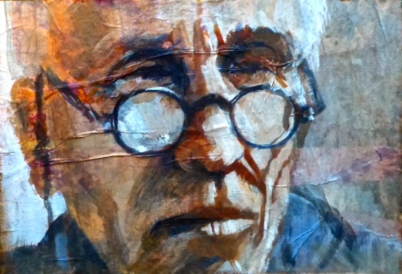
The rest of the drawings are 5 and 10 minute studies.  I didn't feel the portraits captured them very well.  It was difficult to draw small precise shapes with the carbon.
10 minute study 

10 minute study

5 minute study

5 minute study

Sunday, September 15, 2013

TOO DELICIOUS NOT TO SHARE!!!


Art comes in many forms.  Cake decorating at it's highest level is an unbelievable sculptural marvel!  One of my favorite websites is called Cake Wrecks.  During the week they expose in a hilarious way, the professional wreckage of inept cake decorators but on Sunday they showcase stunning masterpieces of edible sculpture.  I had to share today's entries because they are all based on famous paintings.  This creativity and artistic talent needs to be seen by as wide an audience as possible.   These creations were meant to be eaten but I can't imagine cutting into one.  It would feel like a desecration! Go to the link below to see some of the best.  It takes the Cake!


http://www.cakewrecks.com/home/2013/9/15/sunday-sweets-fine-art-cakes.html

Tuesday, August 27, 2013

THE ART AND TECHNIQUE OF PUSHING A STRING!

STRING DRAWING #1

STRING DRAWING #2

STRING DRAWING #3

Want to try something fun?  In my latest drawing book, there was this exercise to dip a strand of a rag mop into ink, hold it at the end and draw with it.  I loved the idea and the challenge.  I think the results have a wonderful quality to them I couldn't get any other way.  This is an excellent way to learn to simplify a subject.  It's not possible to put in little details.  The string won't behave!!!  This process builds your patience, concentration, ingenuity and on and on and on.  You will never get the same results twice.  I started this blog with a drawing I did from a tennis ball dipped in ink.  Hmmmm, what else will make an interesting mark?  

Sunday, August 25, 2013

IT'S OFFICIAL!

AUGUST 25, 1963

Today we are officially married 50 years!  It seems to have gone by in a flash.  Lots of wonderful memories,  fantastic children and grandchildren, supportive families on both sides, special friends and a blessed life.  Through it all, Jerry has always been a constant encouragement and supporter of my art endeavors.  I couldn't have done it without him.  

Monday, August 19, 2013

SURPRISED AND HAPPY!

50 YEARS LATER
The National Watercolor Society published the names of the artists that have paintings to be included in their 2013 International Exhibition.  I was surprised and thrilled to have the above painting included!  I didn't make the cut that past two years, so it is wonderful news.  I like this painting a lot but wasn't sure how much others would take to it.  Trying to second guess the judges is an exercise in futility.  In the end, we have to be the final judge and jury.   I start with a concept or idea, do my best to carry it through, evaluate the outcome and go on to the next one.  I love when others find value in a painting or drawing, but ultimately, mine is the only vote that  counts.


This painting is a tribute to my husband, who has been an unwavering support and cheerleader of my artistic endeavors all these years.  Sunday will mark our 50th wedding anniversary.  
Jerry's Highschool Yearbook Picture 
Still handsome after all these years.

Saturday, August 17, 2013

I SAVED THE BEST FOR LAST!


DEMO DAY 4 BROOKINGS WORKSHOP
DETAIL DEMO DAY 4 BROOKINGS WORKSHOP
This was my favorite demo from the workshop.  I love when happy surprises show up unexpectedly.  Pretty boring if you know exactly what you are going to get before you even start.  I start with an idea and have a mental picture of what I think it will be like.  Of course, that never happens, but I have a direction.  In this case, I have been working on putting gesso on part of an old painting, stamping into the gesso and transferring that gesso pattern onto the rest of the painting so that part of the old painting shows through the stamped pattern.  This time my idea was to gesso the general shape of the image I planned to paint and stamp the rest of the page, thus having more of the old painting showing through and having a total white space for my new image.  The old painting was on YUPPO from a George James workshop I took.  The surface was covered with watercolor and in some areas heavy concentration of watercolor.  Watercolor on YUPPO can be easily activated by moisture because it is just sitting on the surface, nothing has been absorbed into the plastic paper.  The old painting color scheme was complementary with Indigo and Brown Madder (a low intensity red orange).  My new color scheme was a different version of blue/orange compliments.  

Here is where the serendipity came in.  As I scraped the gesso over the old paint, it became activated and some of it mixed with the gesso.  Then, when I painted over the background, the old color activated and mingled with the new color  resulting in some beautiful color I will never be able to recreate again!  I drew the image with walnut ink, a water soluble material, because I wanted to be able to make corrections is necessary.  I love the edges that are created when painted over or next to.  

Now, where are those other cast aside paintings from the GJ workshop?  I want to do this again!

Thursday, August 15, 2013

DAY THREE IS ALL ABOUT THE ELEMENT OF "LINE"!


Have you ever ranked the elements of design according to  your personal favorites?  For me it is Texture, Line, Color, Size, Value, Shape and Direction is last.  On  Wednesday of the workshop we think about the element of LINE and the roll of the dice had me pairing it with the element of color.  The most gorgeous use of a colored line is the mastery of Wayne Thiebaud with his shimmering contour line, and of course, Vincent Van Gogh who constructed stunning paintings out masses of lines, lines, lines.  Another Red/Green complimentary color scheme and we are off and running!  

This is the third painting on this piece of paper.  Two unsuccessful  paintings are underneath.  The letter M was on the previous painting but worked out for this one.  Maybe a letter sweater from college?  I think this will be the final incarnation as I added Portfolio Oil Pastels on top of the paint to brighten things up and bring out the color of the lines a bit. I have never tried to cover oil pastels.  I'm not sure they would cover easily.  

This looks very much like a caricature which are lots of fun to do.  If you appreciate the art of caricature, check out Caricature Showdown 3000 on Facebook.  Every week they pick a different person to draw and paint and then vote on Friday.  The winner gets to select the next subject.  Lots of people submit entries in a wide range of styles, techniques and materials.  Different aspects of the face are exaggerated by each artist.  I love to browse each week and evaluate whether they captured the essence of the likeness.  It makes you think about what makes "us" look like "us".  It turns out that programmers who are working on facial recognition software are studying caricaturists because they see the differences in faces so easily.

Tuesday, August 13, 2013

SECOND DEMO


This is only a quarter sheet.  I wish it was a bit bigger.  I started with an old painting that had been covered with collage .  I love how the collage papers make this very simple drawing and painting so much more interesting.  Roll of the dice called for a compliment with Red Orange and blue green color chord.  

Monday, August 12, 2013

WONDERFUL WORKSHOP AT WRIGHT'S FRAMING AND ART GALLERY !

DEMO BROOKINGS WORKSHOP DAY 1


On the first day of the Variations workshop we deal with the element of SHAPE.  We also roll the dice to see what color chord we must use.  I drew analagous  colors with red.  Playing with shape can be lots of fun.  Distortion is often involved.  Here is my demo using an old unsuccessful painting with gesso stamping as my sub strait.  

Wednesday, July 31, 2013

SERIES WORK!

BLUES MAN

This one had an interesting progression.  It started out as a very precise shape painting.  I wound up keeping the shapes more distinct in the face but softening the edges as it moves away from the focal area.   The International Society of Experimental Artists (ISEA) International Juried Art Exhibit deadline for entering is tomorrow.  I think I will try my luck with this painting and see what happens.

Sunday, July 28, 2013

ONE MORE FOR THE WORKSHOP!

MIKE HENDERSON ELONGATED

MIKE HENDERSON STEP #1


MIKE HENDERSON ELONGATED PARALLAX 

MIKE HENDERSON ELONGATED PARALLAX CROPPED


I think I am closing in on how I want to paint.  At least for this week!!!  I get bored with doing things the same way every time but I want to do more in this style for awhile at least.  

This is the image we are going to use in the workshop I am giving a week from tomorrow.  I put the photograph through some of the filters in Photoshop Elements and created an image that is elongated  with simplified shapes, soft edges and interesting colors.  That is what I started with.  I like my work to have an element of mystery (how did she do that?) This assumes you didn't read my detailed descriptions of exactly how I did "that".  Using a photo program to manipulate an image should just be the starting point.  If you copy the distortion directly then there is no mystery.  I like to use these technical aides as a way to nudge me in the direction I want to go, help me visualize possibilities and then combine it with other ideas for a finished painting

So, using the photoshop manipulation as my starting point, I blocked in the shapes, values and initial color with traditional brushes onto an old painting that I had covered with gesso and then stamped into the wet surface.  I used the same palette from yesterday's painting and the same tools, mostly a thin wooden coffee stirrer and some finger painting.  I managed to stop before I overworked this piece.  I am happy with the balance of line, broken color, intensity texture, hard and soft edges.  

By photographing this piece at an angle, I was able to create another distortion called parallax which gives me my next variation to try.  

Related Posts with Thumbnails