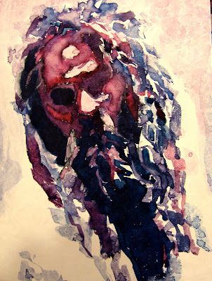

Thanks for all the great comments. Overall, the consensus was that the red line wasn't a winner! I think, if I was to do it again, a pen line with red ink may have been a better choice. It would have been a texture contrast as well as a color contrast. I may try it again. Working this small has it's challenges. I find the fewer the shapes and values, the better the results. I am working with values, shapes and colors. I am not trying for expression or likeness or any other effect. It is interesting how these things appear but it is not intentional.
These were two very interesting color combinations. I thought I would get brighter purples and lavenders with the first combo but Alizarin Crimson is more muted than I thought. It was combined with Cobalt and Paynes Gray (which looks like indigo in the Hydrus line) This image had quite a few values and I struggled to define each one. This image, on a larger scale, would be lots of fun.
The last image was more subtle. Interesting triad of Deep Red Rose, Viridian and Gamboge. I never realized how strong Gamboge is. This painting turned out a little too yellow for my taste but nice intermediate colors and decent darks. I am really enjoying the harmony that comes with working with only 3 colors.
I am looking forward to everybody weighing in with your comments.
Tuesday, December 18, 2007
TWO MORE FOR THE CHALLENGE
Posted by
Myrna Wacknov
at
8:59 PM
![]()
Labels: Monthly Painting Challenge, TYVEK
Subscribe to:
Post Comments (Atom)


2 comments:
Myrna, this is your third twosome of the dreadlocks dude, and in each and every one of them, the first one has the head tilted and the mood is of despair, while in the second one the head is straight up, and the guy seems more forceful. Interesting!!
They are both wonderful - I love the first color combination!!!
Well, I don't know why I tilted the head initially but I think the second image is a conscious correction. Interesting that the tilt of the head can be used to express an emotion. Good for artists and actors to know!
Post a Comment