 |
| THE CLAN #3 |
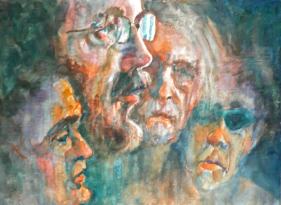
I am not totally happy with this one. The far left head is too small and not a good likeness. The likeness probably only bothers me. I enlarged the head on the right but I'm not sure that one is working either. I am beginning to think I should just do the two center heads. I think it would make a compelling image. I am committed to the four heads for twenty paintings, so it will have to wait.
This is a gessoed surface which I texturized. I don't think the texture is showing up in the photo but it does in person. I like the limited palette I used ....Vermillion, Hansa Yellow Deep, Turquoise and some burnt sienna and burnt umber to start with. These are in the Dr. Ph Martin's Hydrus line. Using Hansa Yellow Deep which is a yellow orange in portraits keeps the image from looking jaundiced. Yellow can be a difficult skin color to work with . I like the loose handling of the paint in most of the image.
I have tomorrow's painting surface ready to go and the drawing is much more abstracted. We'll see if the next painting comes out anything like what is in my head!


4 comments:
Does the son on the right look most like your husband and the other two on the left look most like you, Myrna? I ask because the right two heads (second from right is your husband, yes?) have similar chins and face shapes, and the same with the two on the left (to each other). I think this is fabulous as you have it and I am not noticing the things you have mentioned. I love that you've captured all of them in a similar expression or mood. It is the ribbon tying your clan together! I think it is a strong and most wonderful piece!
I totally understand your frustration with the colors showing up correctly or not on the monitors :( I have the same problem - they show up just right on my Macbook but are very off on our desktop PC! As you mentioned yellows look the worst on my PC screen.
And I like what texture I see in the painting! Looking forward to seeing your newer compositions and ideas! Thanks as always for thinking aloud and sharing so generously.
Hi CL, I think my children are a combination of both my husband and myself. At different stages in their life, they have shifted back and forth. My middle and youngest son don't look much alike but my oldest son is sort of the bridge between the two, visually. Thank you for your interest and kind words.
Thank you, Meera, for your comments. Congratulations on your gorgeous new grandchild!
By looking at the post on my iPad, I have determined that the MacBook image is closest to what others are seeing. I am going to ignore my extra monitor. It is not calibrated very well.
Post a Comment