![]() |
THE CLAN #16 YUPO W/TAR GEL |
Monday, March 19, 2012
TAMING TAR GEL!
I have always been frustrated that I couldn't get tar gel acrylic to go exactly where I wanted. I finally figured out a way to "draw" with it. Using a rubber funnel I put the tar gel into an empty hair dye bottle that had a small but big enough opening. It took awhile but I am happy with the results. YUPO is so smooth the gel flattened out somewhat. I am going to try it on traditional paper and see if it flattens out as much. This version of The Clan is very colorful, lots of fun to do.
Posted by
Myrna Wacknov
at
10:19 PM
10
comments
Sunday, March 18, 2012
SCRATCHING AN ITCH!
![]() |
THE CLAN #15 on YUPO |
Then I covered the painting with black gesso and let it dry. The next part was a bit tricky, trying to find exactly where the images where until I realized that that scraping the gesso was only coming off where the oil pastel was underneath! I was disappointed that so much of the color came off and only left a tint on the paper. I then mixed black and white gesso together and added some blue for the background.
So there you have it: TINT/BLACK/TONE
Posted by
Myrna Wacknov
at
9:13 PM
4
comments
Monday, March 12, 2012
IT'S INTENSE!
![]() |
THE CLAN #14 ( Hue, Black, Tone) |
We have been dealing with one of the most least studied aspect of color: Intensity. The biggest problem is with the word itself. I don't know who decided to describe the purity of a color with the word "Intensity" but it's a done deal and we have to live with it. In English we think of "intensity" as over the top saturation rather than purity, so when you try to explain that a pale tint that is pure in chroma is high intensity, the mind boggles and it feels confusing. It is important that we are all using the same words to describe things in art, so we are stuck. And, of course, not all tube colors are pure Hue, mucking up the color waters even more. It takes awhile to come to grips with the terms and how to integrate the knowledge into successful paintings but that can be part of the fun of this art journey!
Intensity is the biggest element that impacts the mood of your painting, so how can one put that to good use?
There was a world renowned color specialist in the last century (thought sounds weird!) named Faber-Birren who figured out that any color could be described with one of seven words: 1.HUE (Pure hue - outside edge of the color wheel) 2. WHITE 3. BLACK 4. TINT ( Hue plus White) 5. SHADE (Hue plus Black) 6. GREY (White plus Black) or 7. TONE (Hue plus Black and White or Hue plus Compliment. All complimentary combinations consist of some part of Red Yellow and Blue. When all 3 primary colors are present in any ratio, the purity of the color is diminished making it a TONE)
Diagrammed it looks like this:
WHITE
TINT GREY
TONE
HUE BLACK
SHADE
Draw a large circle around the words HUE WHITE BLACK and a smaller circle around TINT TONE SHADE GREY. Now draw a line connecting HUE to TINT, TINT to WHITE, WHITE to GREY, etc. and a line from each of the outside words to TONE in the middle.
If you take THREE of these WORDS that are linked by connecting lines and create a painting using this Intensity Strategy, you will create a different mood with each different combination. Here are a few of the possible combinations.
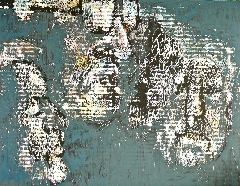
I figured there were 20 different combinations. I wrote each one on a separate slip of paper, but them in a sack and drew two out for my paintings this past week. The above painting is HUE, TONE & BLACK. This is a very challenging but entertaining exercise. Give it a try!
1. White - Grey - Black
2. Hue - Tint - White
3. Hue - Shade - Black
4. Tint - Tone - Shade
5. Tint - Tone - Black
6. Tint - Tone - Grey
7. Shade - Tone - White
8. Hue - White - Black (use primary and secondary colors)
9. Tint - Tone - Shade - Grey (use intermediate hues i.e. red-orange, blue-green etc.)
Posted by
Myrna Wacknov
at
9:29 PM
4
comments
Saturday, March 10, 2012
SURPRISE!
![]() |
MORRIE & ME! |
I was at a fabulous Contemporary Craft Fair today and look who I found!!! This is Morrie. I took a photo of him (with his knowledge and permission for a change) a number of years ago. I had lost his business card and struggled with remembering whether his name was Morrie Elmer or Elmer Morris. Anyway I referred to him as Morrie over the years. He has played a big part in my workshops as the image I was working from and sometimes he was also the image the students were using. I had not run into Morrie again until today. It made my day! I'm sure he was startled to find someone so excited to see him. My friend took this photo and I took a few more of just Morrie but they came out about the same pose as before. His beard and hat haven't changed a bit and with close inspection, this is the same shirt! I am inspired to use his image again. Here are some of the images I e-mailed to Morrie. Thought he might want to see what I have been doing to his face over the years.
Posted by
Myrna Wacknov
at
9:34 PM
17
comments
Wednesday, March 7, 2012
DEMO RESULTS!
![]() |
JERRY - DEMO FOR BURLINGAME ART SOCIETY |
My demonstration tonight was about adding texture to the surface before painting. By the time I finished showing examples of materials to use and how those looked in finished paintings, I had only about 1/2 hour to do the painting. To add to the excitement, they did not have an overhead mirror, so I suggested people could gather around while I painted. Everyone was talking, touching the different materials and conversing with me. Strangely enough, this doesn't bother me in the least. I learned how to filter out what I don't want to focus on years ago when I was very young. This ability has served me well over the years. I think I will add a touch more to the clothing and then call it finished.
There was a woman at the meeting that was telling me all about Madeline Island where I will be giving a workshop in July. It turns out her family is from there and she was sharing all the fabulous places to visit in the area and all the beauty that is in that part of the country. My husband was ready to hop a plane tomorrow! I am getting very excited about going, myself. Combining art and vacation is just the best!
Posted by
Myrna Wacknov
at
9:55 PM
6
comments
Tuesday, March 6, 2012
LOOSING TRACK!
![]() |
THE CLAN #13 |
![]() |
THE CLAN #13 COLLAGED BACKGROUND |
I am starting to loose track of my numbering! This painting I did was on top of an older, unsuccessful painting. The collaged papers were all hand stamped tissue from my extensive collection. Tomorrow I will be giving a demonstration for the Burlingame Art Society. The meeting starts at 7PM. This is the technique I will be showing. It includes some of the ideas that I am going to teach at Kanuga this year. Everything is coming together!
I received an e-mail today letting me know that the Western Federation Exhibition wants to use my painting for their poster and postcard. This is the first time I have received such an honor. Wish I could go to the show in Las Vegas this year, but I have a scheduling conflict. When are they going to perfect the "Beam me up, Scotty" technology. Then we could be two places at once!
Posted by
Myrna Wacknov
at
8:31 PM
10
comments
Monday, March 5, 2012
THE CLAN #12
![]() |
Beginning stage, colored tissue over failed painting. Some Gold acrylic on white tissue in upper right and middle left |
![]() |
THE CLAN #12 |
Posted by
Myrna Wacknov
at
5:35 PM
4
comments
Subscribe to:
Posts (Atom)